Creating a Brand with Spark
CLIENT
The Forum of Executive Women
PROJECT
Rebrand
A mark with meaning and a visual identity refresh to energize today's women leaders and inspire the next generation.
After a strategic discovery process and extensive stakeholder input, The Forum of Executive Women knew it needed a brand refresh.
Vault identified the key drivers of this initiative as reach and impact: help The Forum reach new audiences, engage and inspire current members, radiate positive change, lift women and foster a collaborative and inclusive culture.
Capabilities
- Identity & Brand
- Graphic Design
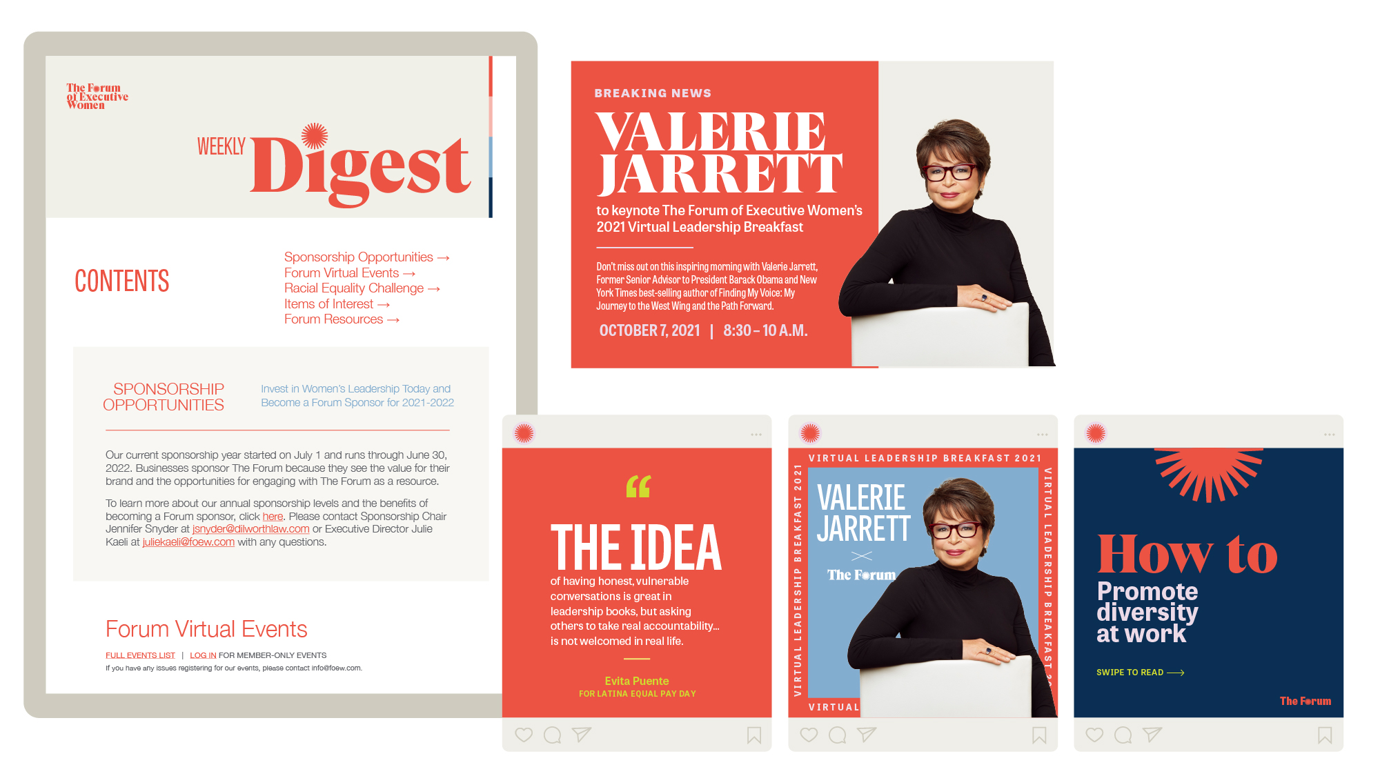
- Social Content

A mark with meaning.
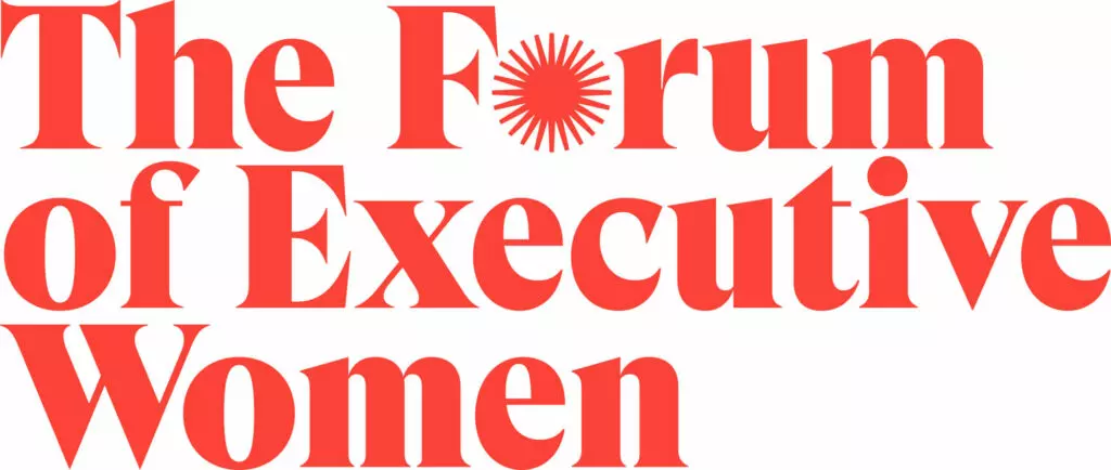
Vault created a mark for The Forum that harnesses the ethos of the brand, at once representing a circle of peers, diverse perspectives, a spark of change for more women in leadership positions, and rising stars of female leadership in the Philadelphia region.
The Forum spark and primary brand color create an immediately recognizable symbol of the energy, power and potential of executive women.
Placing the emphasis on women, where it belongs.
The previous version of the organization’s logo emphasized the word Forum in an overly feminine font. In collaboration with Forum leadership, Vault developed a wordmark that equalized the emphasis on the words Forum and Executive Women.
A bold, high contrast editorial font gave the brand a fresh update, and its signature red brand color was modernized with a digital-friendly and differentiated hue.


Resonance with resounding support.
Because the visual identity was developed in collaboration with Forum leadership and rooted in a deep, authentic and honest discovery process, the launch of the new brand was a resounding success, with positive feedback pouring in from numerous stakeholders.
Clever, artistic, up-to-the minute, creative, talented, fresh and fun are just some of the words that come to mind when I think of the amazing work of Kate Shields and her uber-gifted team at Vault. When they overhauled our brand and helped us rethink our messaging, it gave us just the momentum we needed to reenergize our brand and take our image, impact and reach to the next level!”
Debbie Epstein Henry
Immediate Past President, The Forum of Executive Women
